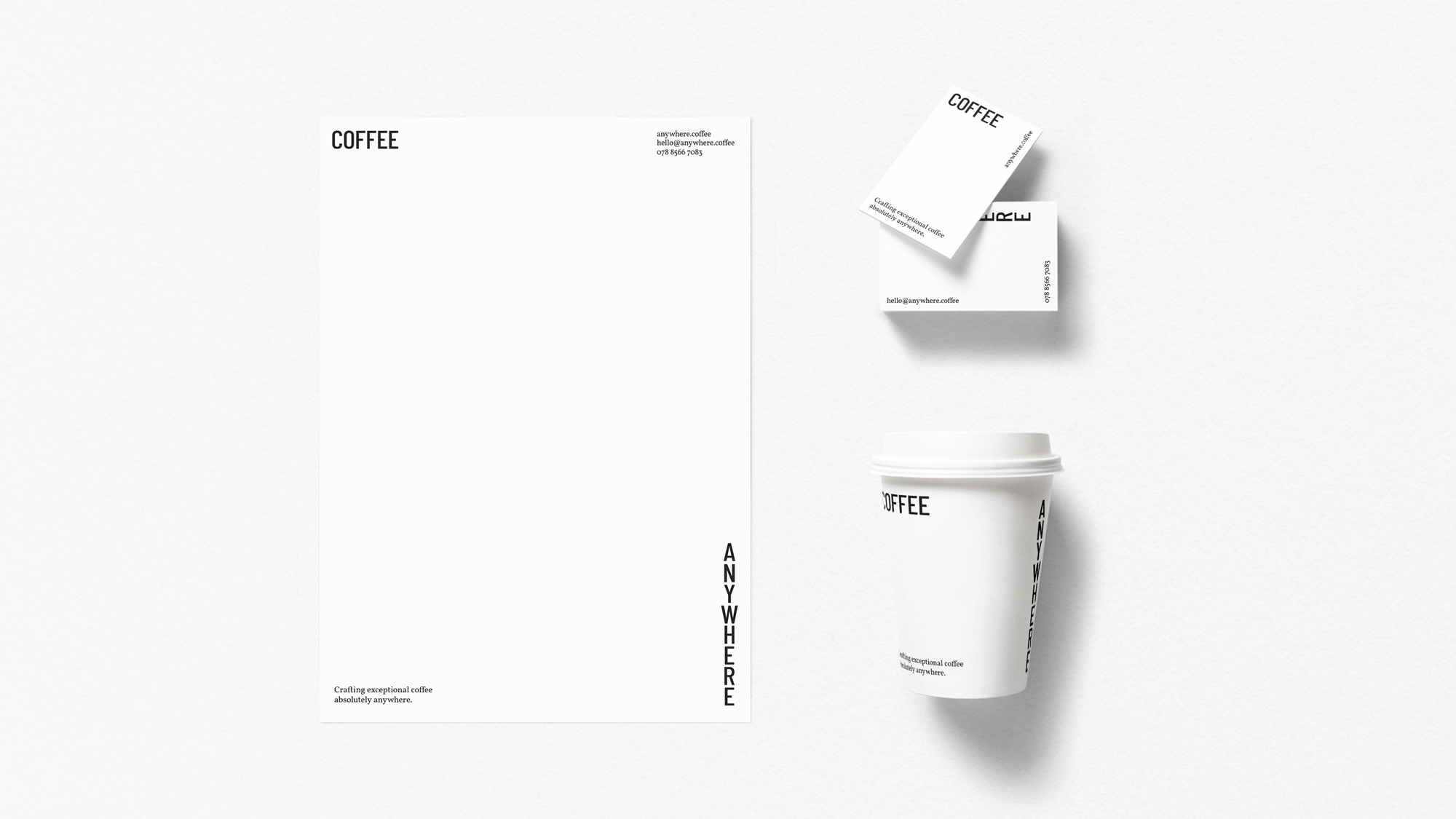
Browns of Brockley has a decade of experience running their independent award winning coffee shop. In early 2019 they decided to branch out into the events industry, providing the same high level of outstanding food and drink on a mobile basis under the name Coffee Anywhere. They asked me to develop a visual identity as well as design and build a simple one page site to promote it.
Coffee Anywhere
for Browns of Brockley
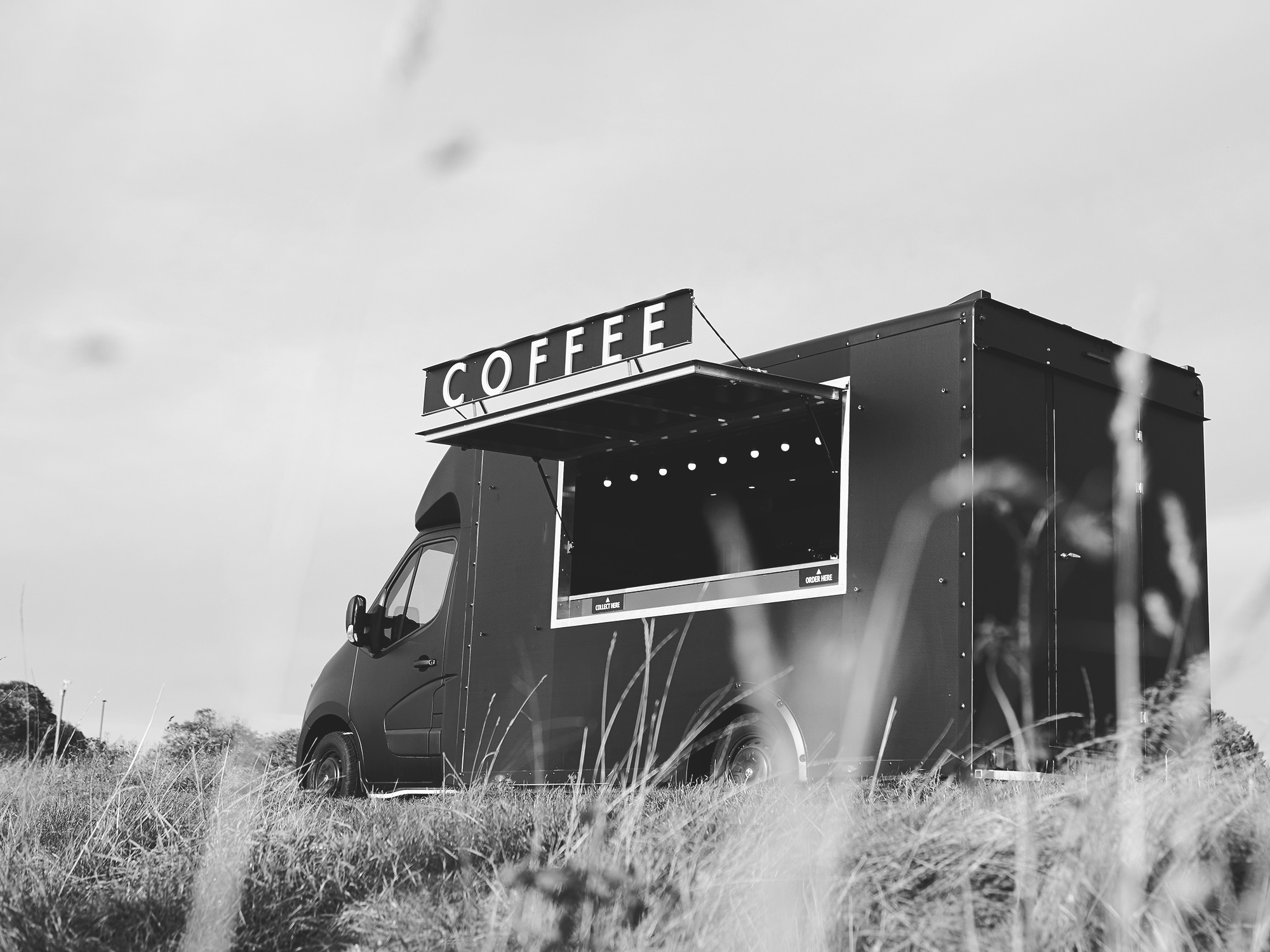
Events of this nature tend to have environments that feature heavy use of the branded elements of the hiring company - due to these potentially competitive visual environments it was important for the identity to be subtle.
At each touchpoint the identity focuses on the position and movement of the word mark in order to highlight the ethos behind the company name in the most direct yet playful manner. Reducing any unnecessary visual elements in this way allows the brand to sit confidently in the background without adding to the noise.


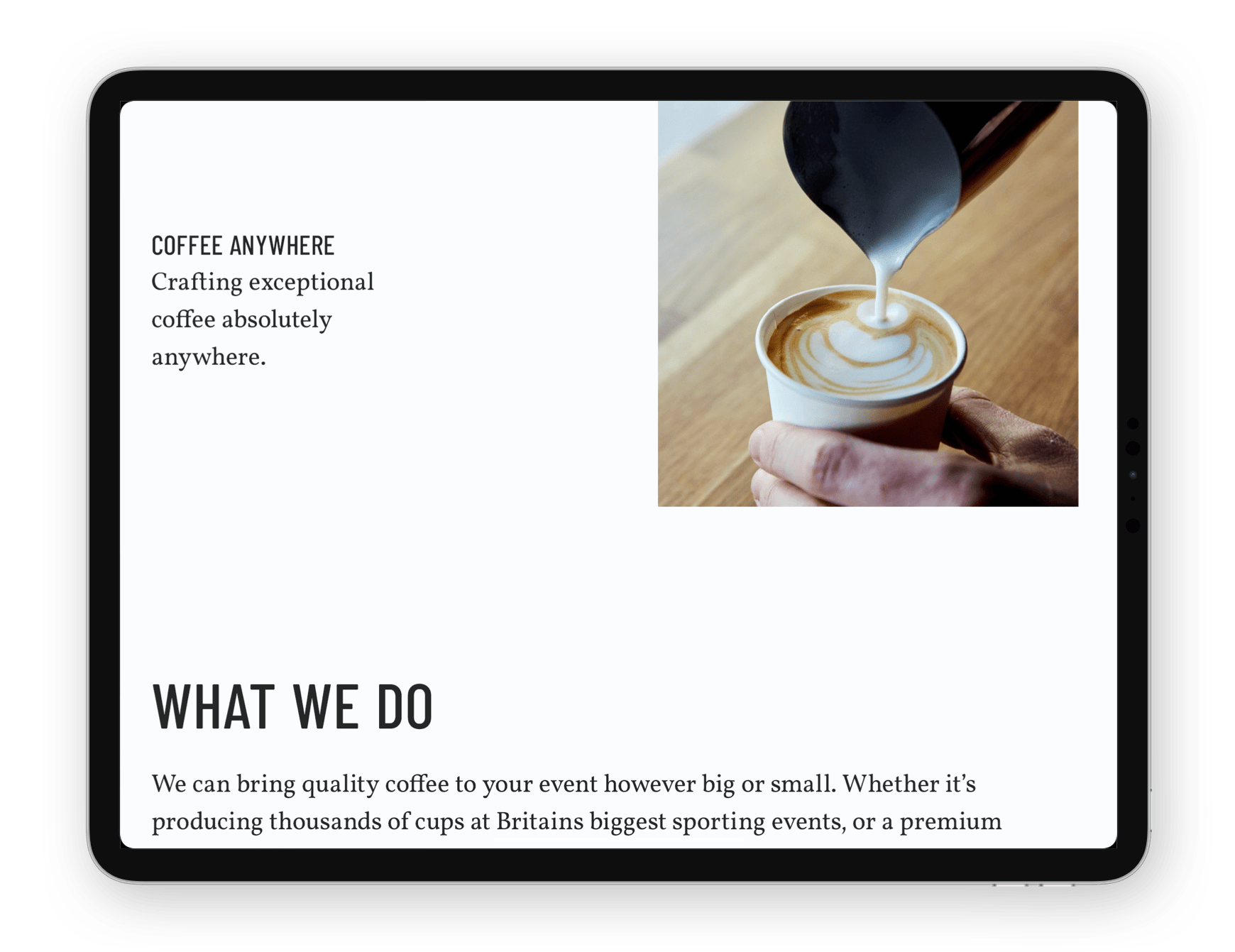
A neutral colour palette utilising an ever-so-slightly off-white and off-black allowing the branded elements to sit comfortably in a multitude of competitive visual environments. The primary brand font is the modern, bold yet slightly rounded Barlow Condensed with the secondary being the modest and understated Vollkorn - its modern aesthetic and contrasting dark and meaty serifs make it a versatile complement to Barlow.
28px / 30px / 0.25px
 Heading 2 Barlow Condensed
65px / 57px / 0.5px

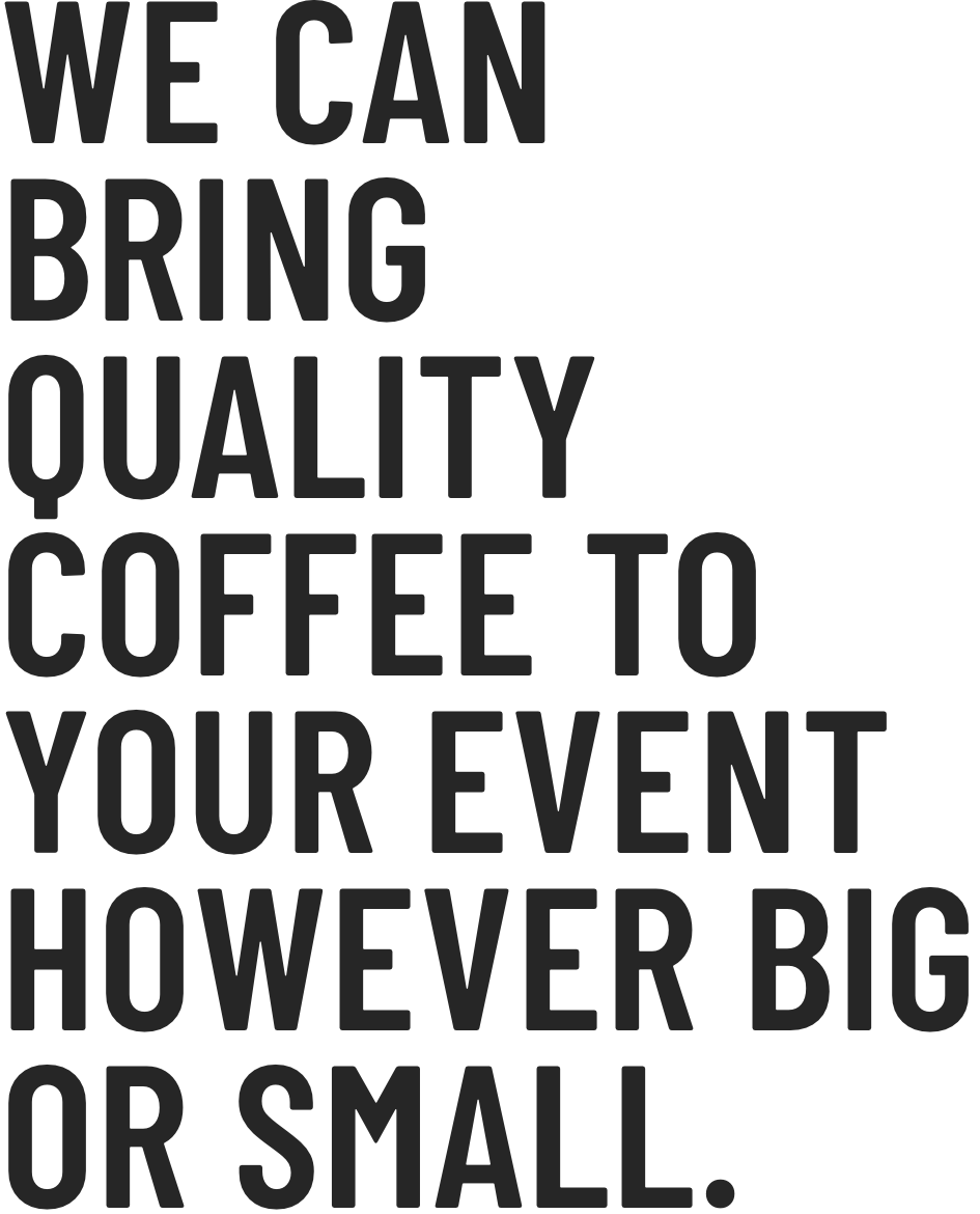
26px / 39px / 0px
 Colours
